Time series trickery: levels lie and differences tell the truth
Part 6 of 9: Statistical fallacies that cost millions

Previous: Base rate blindness: how 90% accurate tests can be 90% wrong | Next: Stretching the truth with a short axis
Your analytics team just delivered exciting news. They've discovered a powerful 0.94 correlation between your company's monthly revenue and global Netflix subscribers.
"This is incredible!" your head of strategy exclaims. "We can predict our revenue by tracking Netflix's growth!"
You're about to restructure your entire forecasting model around this relationship when a nagging voice in your head whispers: "Wait, what does Netflix have to do with our business?" Your company sells industrial equipment to manufacturing plants. Netflix is a streaming service for consumers.
There's no logical connection between these two things, yet the correlation is undeniably strong. What's going on?
You've just encountered one of the most subtle and dangerous statistical traps in time series analysis: the levels versus differences fallacy.
The trending data trap
When working with data over time, we typically see it in what statisticians call "levels" — each data point depends heavily on the previous point. Think stock prices, population growth, or your company's cumulative revenue. Levels are raw totals, whereas differences are period‑to‑period changes.
Here's the invisible problem: correlate two trends (i.e., levels) and you're almost guaranteed to find strong relationships, even when the data is completely random.
Let me show you something that will fundamentally change how you look at time series correlations.
The random walk experiment
I'm going to generate two completely random time series that trend upward over time (mathematically, these are called "random walks with drift"). These series have absolutely no relationship to each other: they're pure noise with an upward trend.
Now watch what happens when I calculate the correlation between longer and longer sequences of these random series:
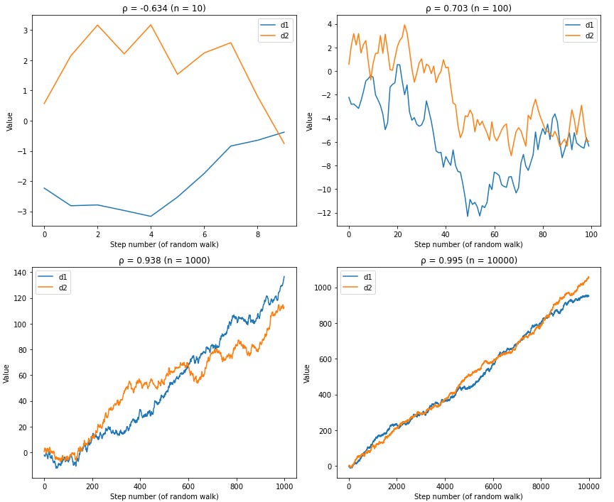
The correlation approaches 1.0 as we add more data points.
This happens every single time, with every pair of randomly generated trending series. Two completely unrelated random datasets will show near-perfect correlation simply because they both trend upward over time.
An unhappy accident
Remember from our correlation post that correlation measures the strength of linear relationships. When you have two time series that both trend upward, you've artificially created a linear relationship.
As you collect more data points, the random noise gets overwhelmed by the long-term upward trend. The correlation coefficient creeps toward 1.0, not because the series are actually related, but because they're both riding the same mathematical escalator upward.

This is why your revenue correlated with Netflix subscribers. Both trends generally increase over time (revenue grows, Netflix grows), so correlation analysis thinks they're related.
How to solve it
The antidote to this problem is surprisingly simple: instead of analyzing the raw "levels" data, analyze the "differences" between consecutive data points.
Levels data examples:
Stock prices: $100, $103, $107, $104, $108
Monthly revenue: $50K, $52K, $55K, $53K, $57K
Customer count: 1,000, 1,050, 1,120, 1,090, 1,150
Differences data (what changed):
Stock returns: +3%, +3.9%, -2.8%, +3.8%
Revenue growth: +4%, +5.8%, -3.6%, +7.5%
Customer growth: +50, +70, -30, +60
Think of it this way:
- Levels = Prices (where you are)
- Differences = Returns (how much you changed)
When you calculate correlations using differences instead of levels, something magical happens:
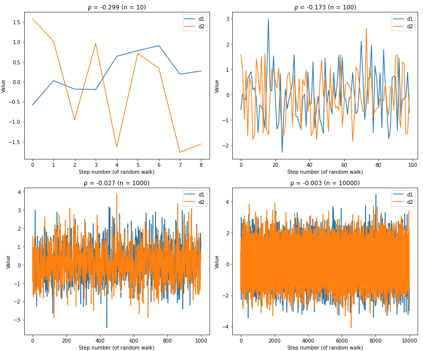
The fake correlation disappears! The differences data shows what we'd expect from random, unrelated series — correlations hovering around zero.1
Study differences, not levels
Computing differences between consecutive data points removes the long-term trend that creates fake correlations. Instead of asking "do revenue and Netflix subscribers both go up?" you ask "when Netflix adds subscribers, does our revenue change?"
Warning signs you're seeing trending noise:
Correlations above 0.8 between any trending variables
Correlations that get stronger as you add more historical data
No plausible reason why changes in X would cause changes in Y
The fix:
Convert to differences first: analyze month-to-month changes, not cumulative totals
Compare both views: high correlation in levels, but low correlation in differences is generally a bad sign
Demand business logic: if you can't explain why the relationship exists, it probably doesn't
Your time series correlation reality check
Time series correlation analysis is one of the most commonly misused statistical tools in business.
The longer your trending time series, the more likely you are to find meaningless correlations that feel statistically significant.
Before basing any important business decisions on time series correlations, ask two questions:
Does the relationship hold across different time periods? Real relationships should be relatively stable, not just artifacts of one trending period.
Can you explain why changes in X would cause changes in Y? If there's no plausible mechanism, you're probably seeing trending noise.
Used correctly, time series analysis is incredibly powerful. Used incorrectly, it will lead you to restructure your business around Netflix's subscriber growth.
This is Part 6 of our 9-part series on statistical fallacies. Subscribe below for more:
Next time: We'll examine how the simple act of cropping a chart can turn statistical molehills into mountains. I'll show you why axis truncation, the visual sleight of hand that makes 0.9% look like 900%, is the easiest way to fool both your audience and yourself, and how this deceptively simple trick amplifies the impact of every other statistical fallacy we've covered.
Catch up on the entire series:
Statistical fallacies that cost millions (and how to spot them)
Base rate blindness: how 90% accurate tests can be 90% wrong
Time series trickery: levels lie and differences tell the truth
Aside: We naively “differenced” in these examples by taking the arithmetic difference between the points. There are a bunch of other ways to difference data, like percentage differences or partial differences.
Our most astute readers will notice that while arithmetic and percentage differences solve this correlation problem, they also remove all trend information from the data. There are some differencing methods that try to straddle between these tradeoffs, like partial differencing, that you might be interested in.