

Stretching the truth with a short axis
Part 7 of 9: Statistical fallacies that cost millions

Previous: Time series trickery: levels lie and differences tell the truth | Next: The winner's curse
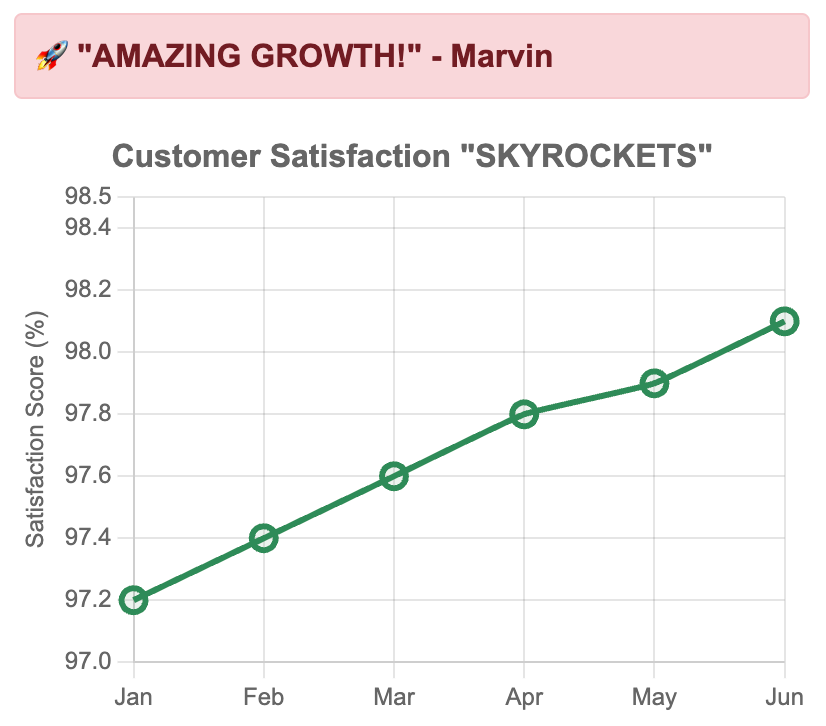
Take a look at this graph from your colleague Marvin's quarterly presentation:
There's something horrible, the equivalent of statistical malpractice happening here. Do you see the problem?
Your satisfaction scores have "skyrocketed" from 97.2% to 98.1%. Marvin's bouncing around the office like he just discovered fire, ready to pitch the board on bonuses and budget increases.
The y-axis doesn't start at 0 — it starts at 97%.
Here's the same data with a proper baseline:
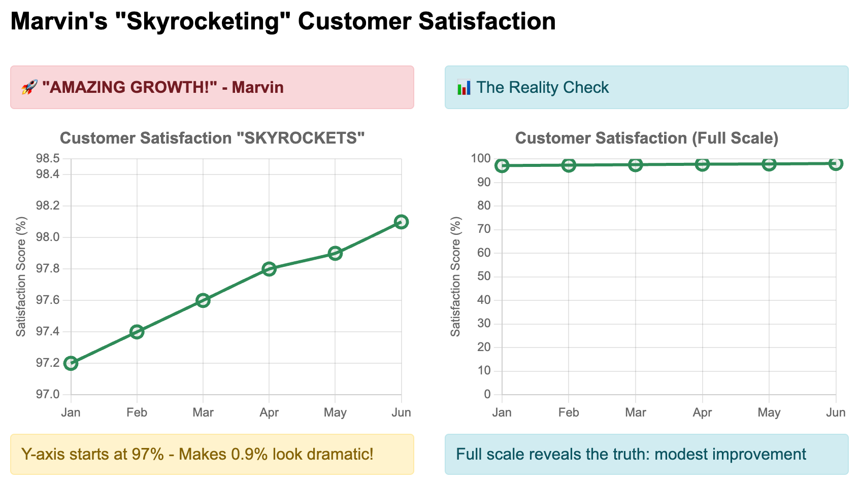
Suddenly Marvin's rocket ship looks like a speed bump.
Welcome to axis truncation: the magician's trick that turns molehills into mountains.
The axis of evil
Axis truncation zooms in on a specific range of data while hiding the bigger picture. From a cursory glance, it might seem harmless to focus on a particular part of the data, but this sleight of hand can have serious consequences.
Our brains fall for this because we focus on the shape of lines, not the numbers on axes. We see dramatic slopes and think "massive change," even when the actual numbers tell a different story.
After learning about this trick, it becomes the first thing I check in any graph. Email from finance? Y-axis check. Quarterly deck? My eyes dart straight to the axis labels. Twitter infographic? I'm scrutinizing the scale before reading the title.
Here are some variants of real disasters I've seen before:
The political poll "collapse": A candidate's support "plummeted" from 52% to 50% in a chart starting at 49%. Normal polling variation got spun into a campaign crisis.
The revenue "explosion": A tech company showed "exponential growth" from $98M to $103M. Investors saw rocket ship, reality was 5% growth.
The safety "revolution": A factory reduced accidents from 12 to 8 per month, but the chart starting at 7 made it look like they'd eliminated workplace injuries.
The scale sanity check
Check where the y-axis starts (this should be automatic)
Ask: does the visual drama match the actual numbers?
Mentally picture it with a zero baseline
Look for missing disclaimers or "not to scale" notes
Beyond fooling your audience, axis manipulation creates false confidence, misallocates resources, and destroys credibility. Teams celebrate modest wins as major victories, budgets shift based on visual illusions, and when reality doesn't match the charts, trust evaporates.
Sometimes you need to truncate, like scientific measurements where 0.1-degree variations would be invisible on a full scale, or stock charts where relative changes matter more than absolute values.
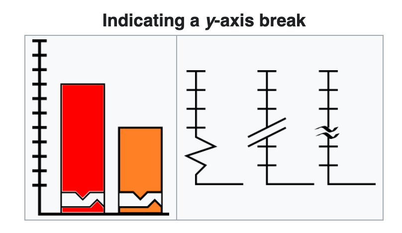
The difference: honest truncation is transparent. Add zigzag breaks in the axis, include "chart not to scale" notes, or show the full context in a second chart.
The untruncated truth, and nothing but the truth

Your job isn't to create impressive-looking graphs — it's to uncover truth in the numbers.
A chart can be technically accurate while being practically deceptive.
Marvin's 0.9 percentage point improvement was real and potentially meaningful. But it wasn't the revolutionary transformation his chart suggested. By fixing the axis, you helped the board make decisions based on reality rather than visual illusion.
The rule is simple: make your charts inform, not deceive.
This is Part 7 of our 9-part series on statistical fallacies. Subscribe below for more:
Next time: We'll explore one of the most psychologically powerful fallacies: survivorship bias. I'll show you why studying only the winners gives you dangerously incomplete information, and how the famous WWII bomber story reveals a cognitive trap that affects everything from business strategy to career advice.
Catch up on the entire series: